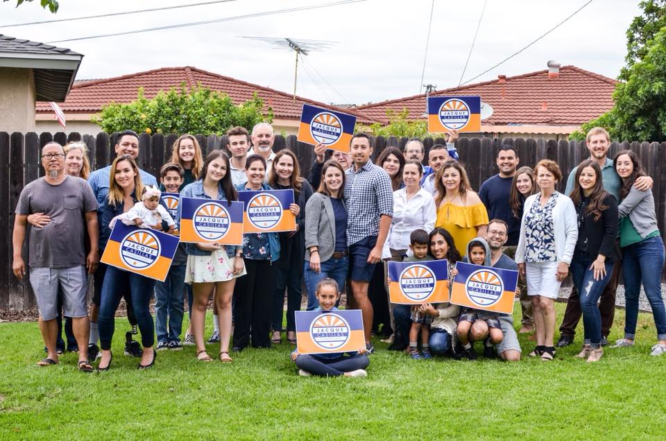
Jacque Casillas and I first worked together in 2016, when she successfully spearheaded a ballot measure to redistribute the city districts of our hometown, Corona, CA (and thus finally challenge the long-reigning city officials to more realistically reflect the diversity and income levels of the populous). This paved the way for her to get elected to city council after a successful political campaign. I am beyond proud to have been able to design her logo and campaign assets.
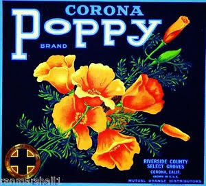
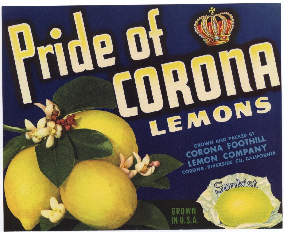
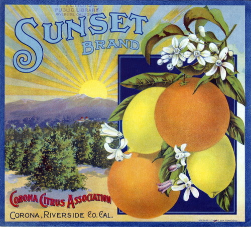
Corona is famously the city of citrus, having been largely responsible for Sunkist’s citrus supply. While the city is now more concrete than orange grove, it was important to Jacque that we reflect the culture of our town in her branding. With that in mind, I drew inspiration from the classic orange crates so iconic to Corona.
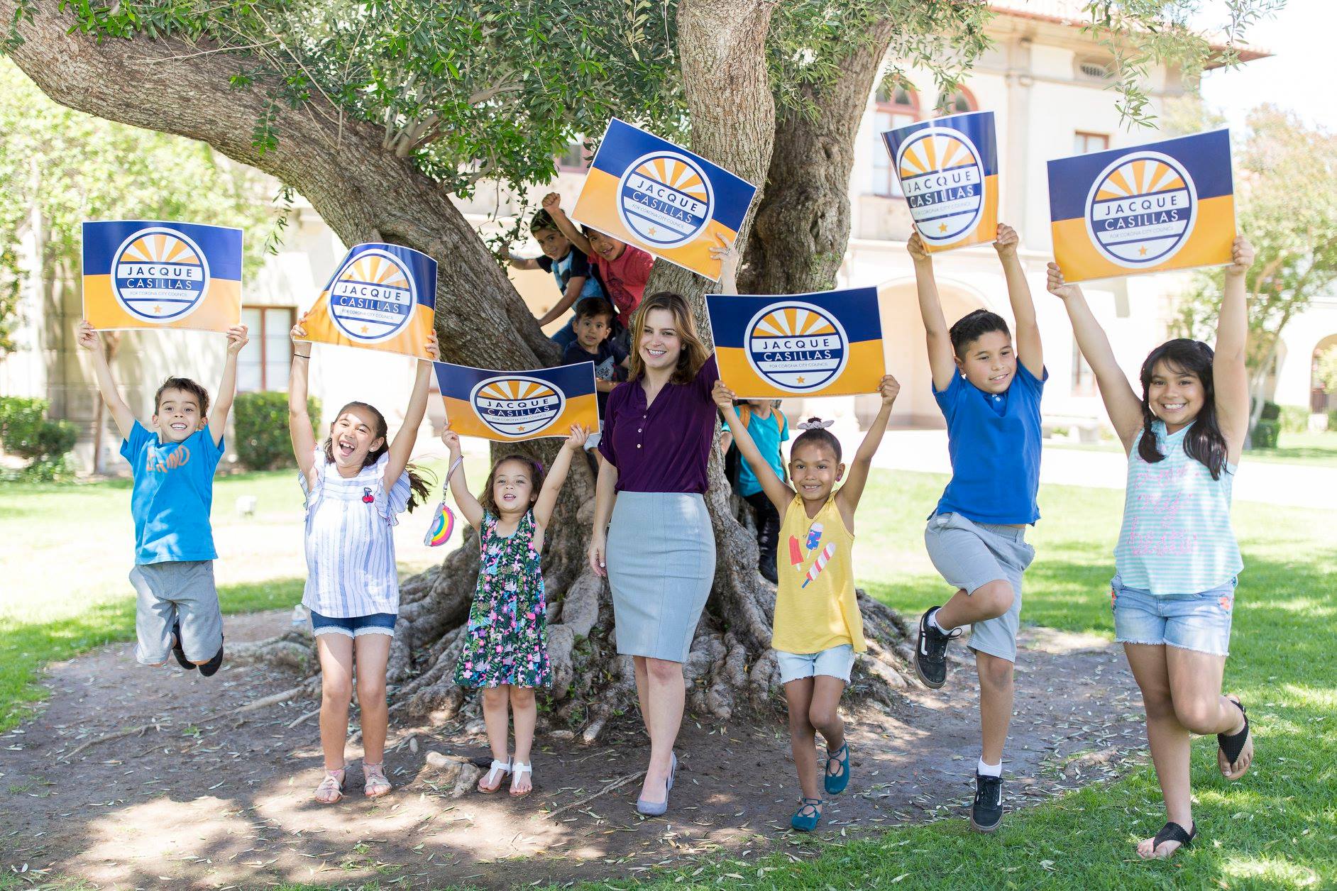
We wanted something bold and eye-catching with a yellow that invokes citrus, while still having contrast from the white and a blue that is not overtly political, yet indicates forward momentum. There are five rays of sun to symbolize the five districts and a single star at the bottom to represent District 1, the seat for which Jacque was running. A clean sans serif font was chosen for maximum legibility.
The logo appeared on assets such as the website, shirts, lawn signs, and billboards. I am very proud of the work I did for a woman I wholeheartedly believe in and, more importantly, for the town that raised me.


